Before and After: A Print Makeover
 |
| BEFORE |
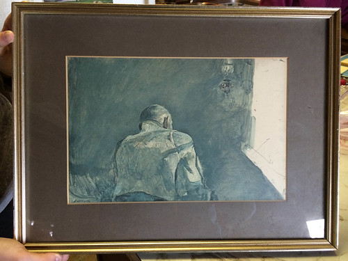
Last weekend I was at a rummage sale, and this print jumped out at me. Something about it seemed familiar, although I couldn't place it. I had no idea why I liked it, so I walked away, only to come back to it. Apparently I couldn't leave without the mystery print. It just needed a little makeover...
 |
| AFTER |
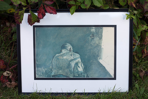
After taking the print apart, I discovered it was an Andrew Wyeth (have you seen his painting Christina's World?! It's beautiful in person!) print called Spring Sun. After looking it up online and taking a closer look at where the mat had slightly covered the edges, I could tell that the print had faded a lot, to a greenish hue. You can see what the original looks like here. I must say that I prefer the faded look!
I painted the frame black with a couple of coats of acrylic paint and then finished it with artists' varnish. I then got out one of my favorite tools in my craft arsenal, my Logan mat cutter, and cut a double mat with black and white. I think the black and white highlights the nice color that the print faded to.
What do you guys think of this print? I think what I like about it is the light from the window, and the composition. Don't you just wonder what this old man is thinking?

I can't believe what a MASSIVE difference changing the framing has had - well done to you for seeing the potential and rescuing the old print!
ReplyDeleteHappy Friday!
Carly
x
your makeover is perfect!!!!
ReplyDeleteWhat really intrigue me is that you can only see the back of that man, who is mysterious ….. !!!!!
xxxxxx Ale
Yes, I prefer the faded version too, it's softer. You've given it a more modern look with your new framing and it brings the blue-grey colours out better!
ReplyDelete